
Download and subscribe on Apple Podcasts, Stitcher or TuneIn
Art Matters is the podcast that brings together popular culture and art history, hosted by Ferren Gipson.
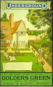
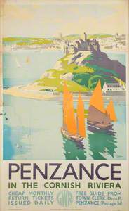
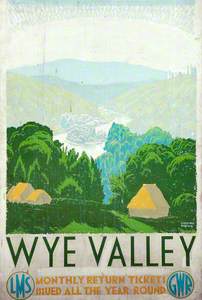
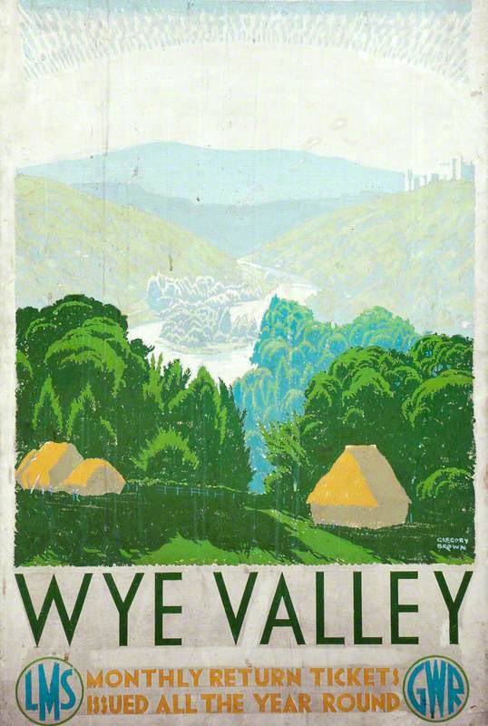
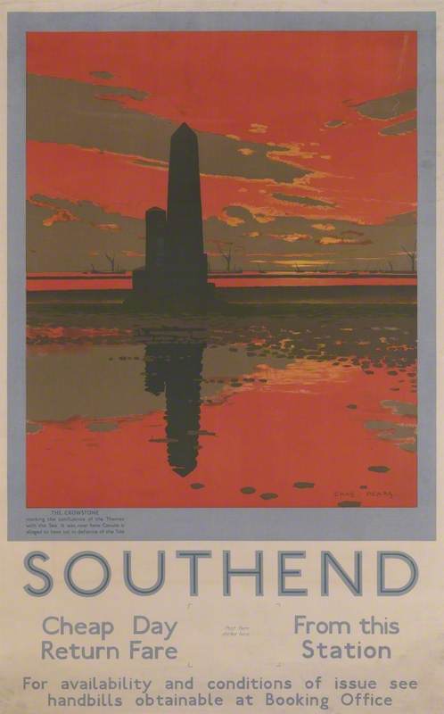
Many of us are fantasising about setting off to explore any place other than the inside of our homes these days, so let's take an imaginary journey via the beauty of twentieth-century British railway posters. These iconic illustrative posters were commissioned by railway companies to tempt travellers to explore the country, and several of the paintings for these posters are now held in public art collections. Early railway posters were produced by letterpress and consisted of text with no images. It was once lithography printing became cheaper in the twentieth century that we began to see little vignettes and, eventually, the large scenes we've become familiar with on these posters. The posters advertised for various rail companies and the destinations they served, but there was another objective that we can still see on rail advertisements today.
'It was really about encouraging what we would call off-peak travel. The railways had a real problem getting people to use the trains outside of commuter times,' says David Bownes, who runs the site Twentieth-Century Posters. 'It's about creating a sense of the day trip at the weekends or a bank holiday trip to the seaside.'
It seems that the posters were effective. Workers gained a legal right to holiday leave in 1939 and this development in combination with railway advertising helped drive an increase in the number of people taking day trips. There were several railway lines servicing destinations around the country, so in order to manage the needs of these different areas, railway companies would often work together with seaside destinations to commission poster artists. Artists might be paid £10 for their work at that time, which is equivalent to around £800 ($987) in today's money. At the forefront of the earlier artists was the illustrator John Hassall.
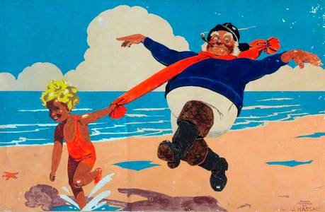
Skegness is So Bracing
(London and North Eastern Railway poster artwork) (after John Hassall) 1935
Frank Newbould (1887–1951) 
'[Hassall] developed a type of poster where the image is the central thing and the text is very much reduced,' says David. 'His most famous poster is called Skegness is So Bracing, and it shows a rather jolly rotund fisherman skipping across the beach at Skegness. It's supposed to give a joyful impression of a day trip to Skegness – that it's healthy and a good day out.'
Hassall's Skegness image was copied and reused on posters many times. There's a later copy of it in the National Railway Museum collection by Frank Newbould that adds in a figure of a child tugging on the fisherman's scarf as they both splash merrily across the beach. Newbould's other poster work is very different to this example, with a flatter, more graphic quality. This may be because he was working a bit later than John Hassall. Posters in the early twentieth century during Hassall's era are more cartoon-like because many of the artists came from a background of illustrating weekly magazines.
'They were, in effect, one of the few groups of artists in Britain who were used to doing big bold images with a slogan – usually a caption – for something like Punch magazine,' says David.
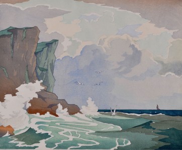
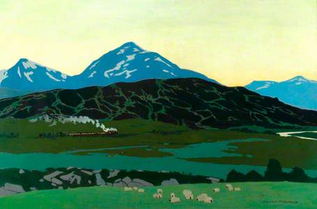
Ben More from Killin Junction
(London, Midland and Scottish Railway poster artwork)
Norman Wilkinson (1878–1971) 
As we discussed in our episode on Ladybird book illustrators, there were fine artists around the period of the First and Second World Wars who only took on commercial illustration jobs when they were in need of work, but there were some artists who were always happy to work on commercial projects, such as the Charles Pears and Norman Wilkinson. Wilkinson's work can be found in the National Railway Museum collection and in various other collections around the UK. His paintings for posters are instantly distinguishable from his fine art by their bright, flat colour fields and picturesque scenery. He also created posters for the British government during the World Wars and famously invented the zebra-like dazzle camouflage for ships.
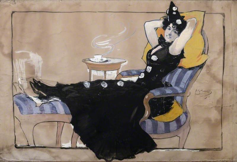
The advertising industry was very male-centric around the mid-twentieth century and there weren't many opportunities for women artists, and we see this same gender disparity in poster commissions for railway companies around the same period.
There are a few exceptions: people like Doris and Anna Zinkeisen.
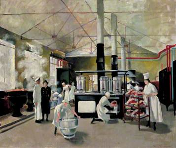
A Women's Royal Naval Service Galley
1945
Doris Clare Zinkeisen (1898–1991) 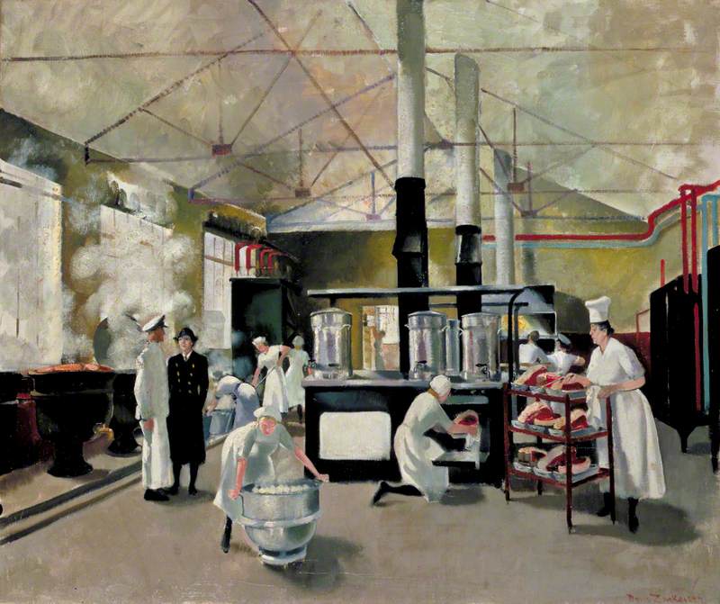
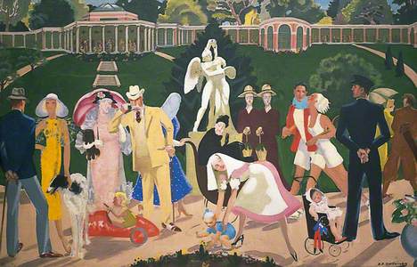
Valley Gardens with the Sun Pavilion in the Background
c.1935
Anna Katrina Zinkeisen (1901–1976) 
Doris Clare Zinkeisen was a multi-talented artist who designed costumes, theatrical sets, and railway posters in addition to creating fine art paintings. She also served as a nurse and war artist in the Second World War, and some of her war images can be found in the Imperial War Museum collection. Her sister Anna Zinkeisen served as a medical artist and nursing auxiliary during the Second World War and also has artworks in collections across the UK.
Across the twentieth century, poster styles shift in line with broader design trends and move away from the cartoon-like quality we discussed earlier.
'By the time we get to the 1920s, railway companies are adopting a flat colour approach,' says David. 'Simplified shapes and often unreal colours. So, sometimes you get fields that are mauve or skies that are red.'

From the 1940s, railway poster design work was increasingly carried out by design agencies rather than commissioning artists directly and this trend continued into the 1960s. By the 1970s and 1980s, most companies had moved into using photography on posters and some opted to feature pop stars and celebrities. Ironically, this switch to depicting celebrities on posters removed some of the glamour achieved by the picturesque paintings on older poster styles. When companies became aware of this, they tried to revive that early-twentieth-century style in some campaigns.
What's interesting about these posters is that they aren't just beautiful advertisements enticing us to travel the rails – they are a part of our collective visual culture that has helped shape the way we view the places we live.
'This proliferation of posters began to create a real sense of distinct areas – whether it was the Lake District, whether it was Scotland, the mystical land of Cornwall and Devon, or the sunny side of Britain,' says David. 'These were terms that were created by the railway companies. They were at the cutting edge of that type of place marketing, as we would call it today, and they really gave a sort of coherent language to Britain to make it easier for people to make decisions about where they were going to go on holiday.'
Listen to our other Art Matters podcast episodes