Art UK has updated its cookies policy. By using this website you are agreeing to the use of cookies. To find out more read our updated Use of Cookies policy and our updated Privacy policy.

Supporting students to read pictures by themselves

There are certain simple questions you can ask yourself and your students when looking at art. Answering these questions can reveal the unique elements that make up that work of art. This question and answer method will increase their visual literacy – The Superpower of Looking. By repeating this process with your students across Superpower lessons, previously hidden or encoded meaning will become increasingly easy for them to decode. In the process, students will become familiar with a vocabulary that will help them analyse and articulate what they see.

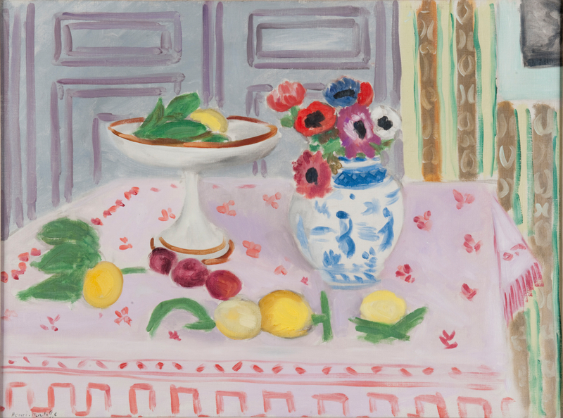
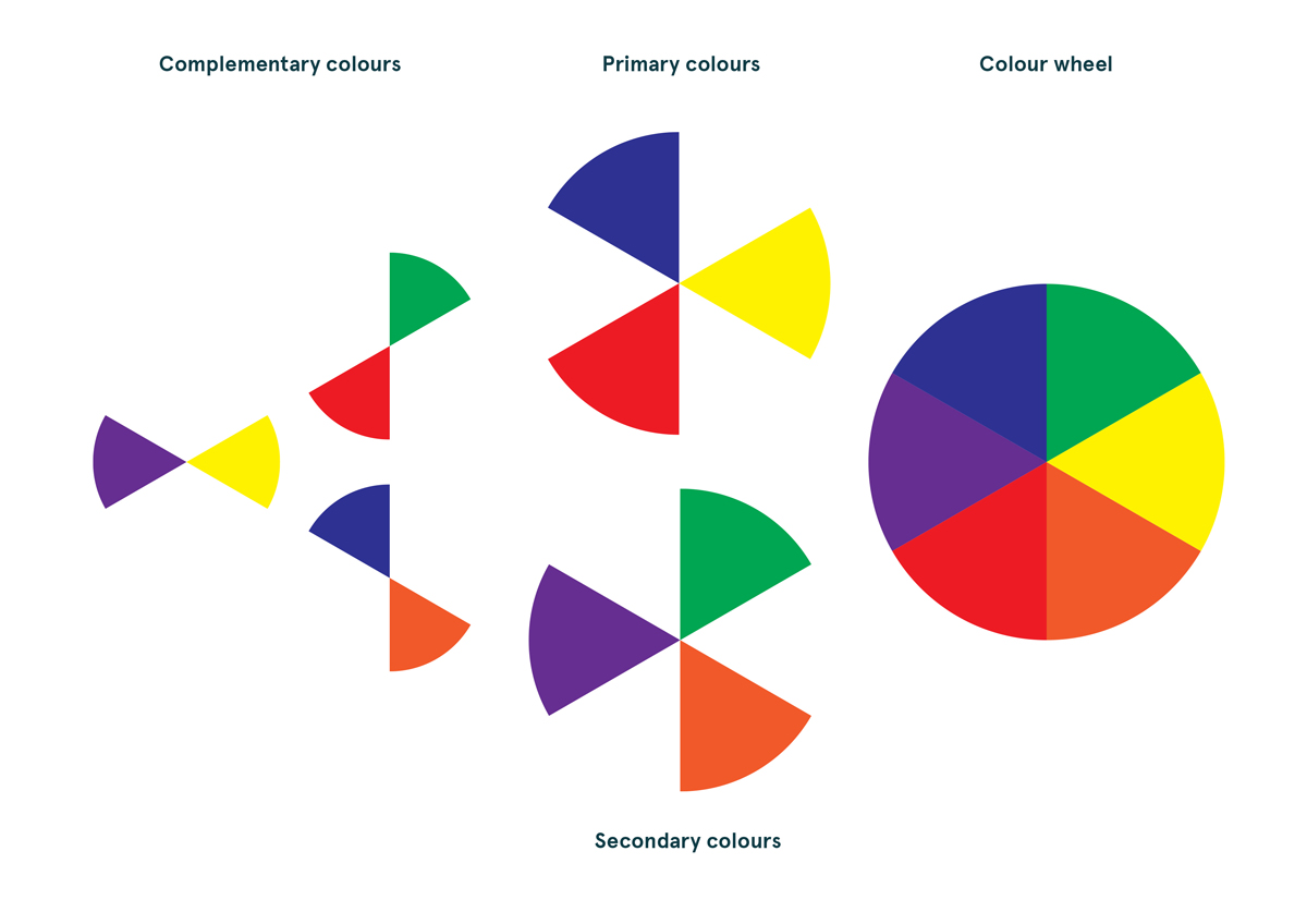
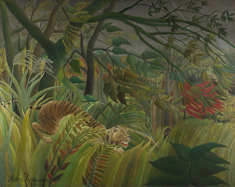
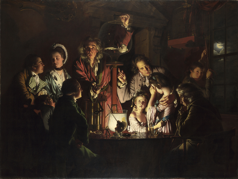
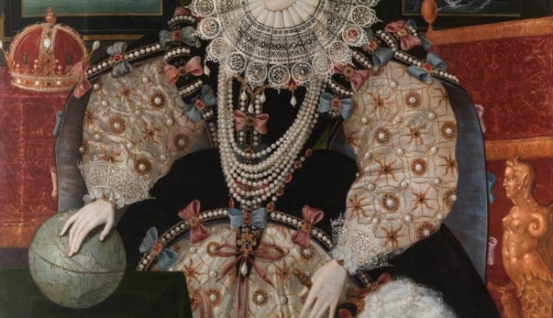
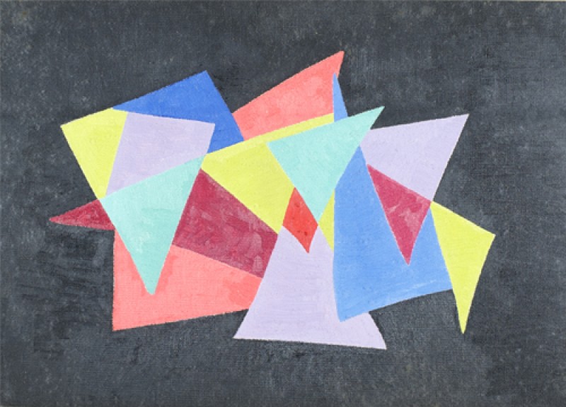
Below, key elements which make up a painting are explained alongside a set of questions to support students to interpret them in relation to different pictures and images. They are: composition, space, colour, line, light, scale, materials and techniques, and finally, figures – their expression, gesture, symbols and attributes.

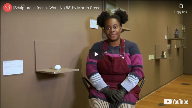
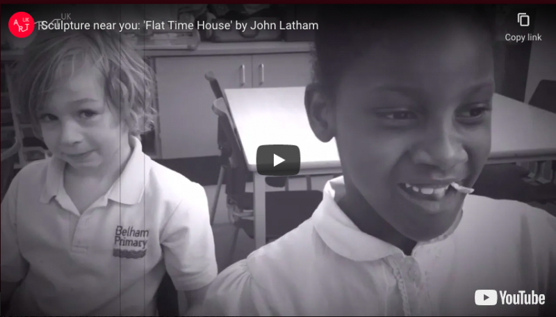
Before you start, the following film demonstrates The Superpower of Looking Kit in action. 

Top tips

  • Complete the initial stages in each Superpower lesson resource first; when you get to the 'Questions from The Superpower of Looking Kit' section, there are suggestions as to which elements of the Kit to focus on in relation to each picture.
  • It may be worth considering narrowing down how many questions you ask at one time by focusing on those most relevant to a particular work and/or those not yet covered in previous discussion.
  • Reword or rephrase questions to suit the current knowledge and understanding of your students; their art vocabulary and confidence in using it will increase across each lesson. 

The Pink Tablecloth

The Pink Tablecloth c.1924–1925

Henri Matisse (1869–1954)

Glasgow Life Museums

Colour

For some artists, colour is very important; for others, it may be line or brushwork. It's up to us to work out the importance of colour and its significance by asking a few questions. 

  • What range of colours has the artist used? In other words, what is their colour palette? Perhaps the artist has used very little or no colour (black/white/grey – monochromatic). Has the artist used primary colour (red, blue, yellow)?. These colours are bright and pure so what effect do they have? Has the artist used secondary colour (orange, green, purple)?
  • Has the artist used warm colours (red, orange, yellow) or cool colours (blue, green turquoise), or both, and if so, how does that affect the way we feel about the painting?


Colour diagram

Colour diagram

  • Has the artist used complementary colours (these are opposite colours such as red/green; yellow/purple; orange/blue)? These combinations provide a 'pop' effect. Why has the artist chosen to use colour in this way?
  • Has the artist used saturated colour (bright and vivid) or is the colour pale and washed out?
  • Has the artist used colour descriptively, as we see it in nature (the real world) or expressively and non-naturalistically?
  • Is the painting modelled to create a realistic three-dimensional effect or is it flat, using colour in blocks, to create a two-dimensional effect? 
  • Has colour been used expressively to express emotion and create mood, e.g. psychological tension? 
  • Has colour been used symbolically, in accordance with social convention, e.g. darker colours signifying low mood or evil, red signifying passion or war, depending on the context? 
  • Have similar colours been dotted around to create a sense of unity in the composition? Or, has colour been used to create clashing disharmony?

Do you know someone who would love this resource?
Tell them about it...

More Art UK resources

See all