Amidst the recent vortex of political analysis, soothsaying, back-tracing and back-slapping in response to the referendum result, imagination and emotion, particularly that stimulated by images has been spinning around. Poster art, caricatures, info-graphics and logos have all been circulating and communicating a range of opinions.
The political prowess of pixel and pigment is unsurprising. If we look across the UK's collection, we can find ample examples of the visual arts being galvanized to realise political aims, assist with governance and reflect upon their unpredictable stream of results.
If we look to the 1500s, we know that image, visual expression and display were a huge part of Henry VIII’s politics. From The Field of Gold, a key summit, which was more of an optical duel than intellectual deliberation to his later appointment of Hans Holbein, as the official court artist, looks were seemingly everything. As Henry himself commented, ‘I can make any number of men of title but I cannot make a Holbein’.
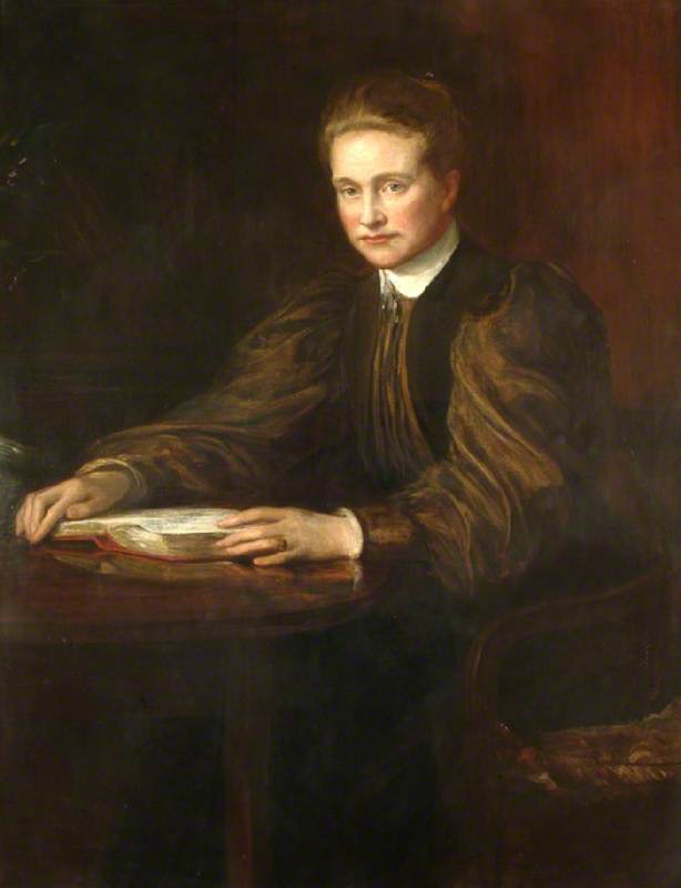
Given this penchant for pomp and paint as soft political power England’s independence from Papal Rome and Henry’s creation of a sparkling new Church of England, put Holbein into overdrive. We can see from a portrait of one of the movement’s architects, Thomas Cromwell, made as he settled into his role as Chancellor of the Exchequer, the King’s Secretary and Master of the Rolls, how art was used to claim and command these new principals of faith.
Thomas Cromwell, Earl of Essex
(copy after an original of 1533–1534) late 16th C
Hans Holbein the younger (c.1497–1543) (copy after) 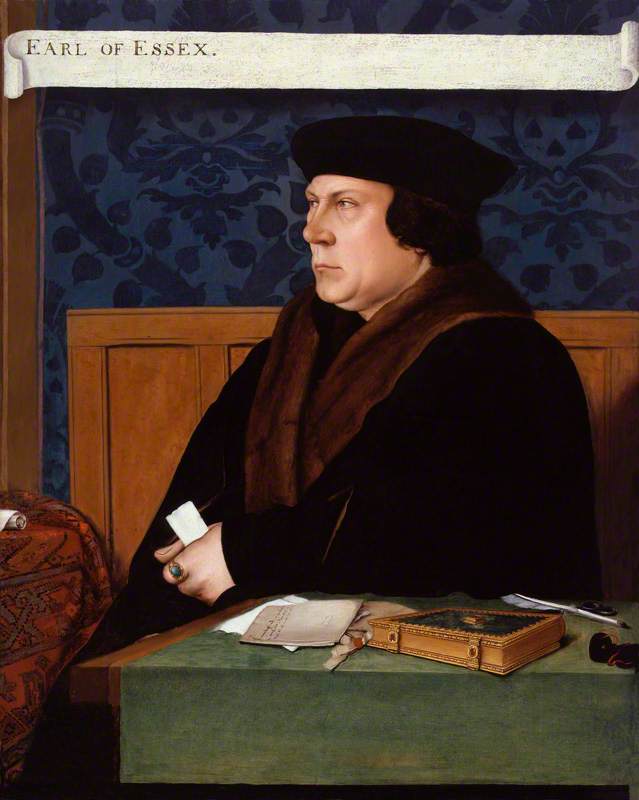
We can see that Crowell’s tight grip on a key decree is willfully highlighted against the flat black robe. In fact, this is clearly the brightest component of the painting, far more bleached than the yellowing scroll pronouncing one of his titles, ‘Earl of Essex’. Combined with Cromwell’s steely expression, melting, gluttonous, and disproportionately obese cheeks, which were de rigueur at the time, this image clearly evinces the strength of the Church of England. It is defiant and revels in the transfer of wealth and religious legitimacy from Rome. It is perhaps little surprise that this image contributed to Cromwell becoming known as the ‘Hammer of the Monks’.
If Henry VIII was using images to create a new religion with his thick, cuboid, padded figure at its core, then it is of little surprise that his daughter, Elizabeth I was similarly an aesthete. She was a most visually conscious of Queens, obsessively rubbing whipped egg whites onto her skin for brilliance, removing blemishes with a mix of turpentine, hogs fat and honey, to ensure that the tight campaign of authorized official images she ran had full affect.
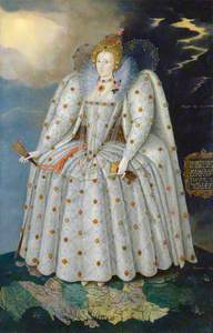
Queen Elizabeth I ('The Ditchley portrait')
c.1592
Marcus Gheeraerts the younger (1561/1562–1635/1636) 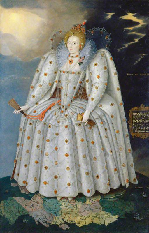
This was a considerably successful political ploy, which ensured that this facial appearance, shown by the Ditchley portrait and many replications, became en vogue. Nationhood was being built on appearance and clipped eyebrows, golden locks dyed with rhubarb and white wine, cheeks and lips stained with vermillion gained popularity to the extent that Sir Walter Raleigh reported back from Guiana, on another form of less permanent dye: ‘divers berries, that die a most perfect crimson and Carnation… the more the skyn is washed, the fayrer the cullour appear’
Visuals and aesthetics as political strategy are, as the Queen’s global pedestal in this portrait suggests, also an effective means of consolidating and expressing imperial ambitions. The placement of her delicate feet on England teetering, ready to step forth onto and into the world pre-empts the use of images and detailed mapping projects we later see emerging during Britain’s moments of empire.
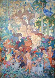
Frank Brangwyn’s series of British Empire Panels, a 16 part mirage of produce, people and industry shows us how making this period multi-coloured and imaginary made a continually warping and expanding sense of Britain palatable.
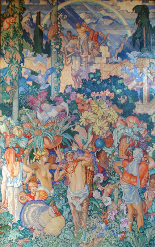
But for who? This colourful cornucopia, which followed the popular aesthetic of William Morris his teacher, was meant to make the changing and challenging world comfortable for the House of Lords. Lord Iveagh had measured up the walls of the Royal Gallery, sent the dimensions to Brangwyn, and awaited the delivery of 3000 sq ft of what he thought would be beautiful studies of botany and benevolent bodies.

However, although these metaphorical countries look exuberant, plentiful and obliging from afar, they were confrontational. If we look closely at panel 11 representing India, there is a central man with sneering eyes, fruit is falling from the head of another, there is a child with an uncomfortable and craned neck and a series of white bodies in distinctly Indian dress.
This non-conformist view can perhaps help us understand why this series was rejected by the House of Lords, and sent away to the Swansea Guildhall. The artist had diced with criticality and added elements to the work, which exposed the uglier and exploitative side of empire. There were quite obviously things the political establishment did not want to see, and holding the purse strings they had every impetus to steer and direct their daily view.
If we move from these images commissioned by monarchy and establishment to promote political ideals, enhance foreign policy and self-image, to those made by independent artists things change. Works made by artists less attached to the establishment can be sharper, and more reflexive. These works can provide political commentary, and engage with popular opinions and debates.
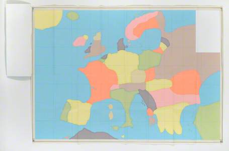
Never Eat Shredded Wheat (Memory Maps), German, Male, 33
1996
Mariele Neudecker (b.1965) 
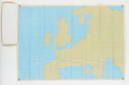
Mariele Neudecker’s series, Never Eat Shredded Wheat (Memory Maps) is particularly relevant. Made in 1996 during the year of the Euro referendum and its subsequent rejection, the collection presents nine European characters represented as maps. The work plays with a standardized perspective of the world and imagines new formations. She uses block colours to create a sense of childlike possibility except when it comes to depicting ‘English, Female, 35’. Here there is an anomaly. A conventional green map is presented; what else is this suggesting? And where is Scotland?
Never Eat Shredded Wheat (Memory Maps), English, Female, 35
1996
Mariele Neudecker (b.1965) 
This is a conceptual piece, with many meanings, which needs to be left for you the viewer to decode. However, what should be very clear and shown through this combination of works is that shaping national politics, defining a country’s contours and responding to political changes relies on images, art and visual relationships.
These can be generous and flattering impressions, as the works made under monarchies show, which convincingly provoke the visual imagination and encourage certain behaviors and beliefs. Or as Frank Brangwyn’s subtle censorship shows, images sponsored by political institutions sometimes willfully do not conform, and can be rejected and hidden when they fail to meet expectations.
There are an abundance of sources available on this site and beyond, which, like Neudecker’s series, emphasize the power of visual rhetoric to fictionalize, forge and formulate political relationships. These artworks should be explored and used. But beware; particularly in times of digitisation, images reach far and wide. They can be quick, easily digestible and persuasive. For as the proverb goes, ‘seeing is believing’.
Cleo Roberts, Visiting Research Associate at Wolfson College, University of Cambridge.
Editor's note: More of Cleo's writing can be found at The Conversation.