


Blue moon. Blue Monday. Blue blood. Blue-collar worker.
Historically, the colour blue has had a wealth of connotations. Once believed to have mystical powers in the ancient world, centuries later the colour was associated with royalty, before blue dye was used for uniforms in the navy, hospitals and industrial factories.
Today, psychologists claim that blue is hardwired into the human psyche and contributed to our evolutionary development as hunter-gatherers, who once learnt to survive in the wild among the blue skies and waters. The power of blue is so accepted that designers often choose the colour to decorate offices, believing research that it boosts productivity and feelings of calm.
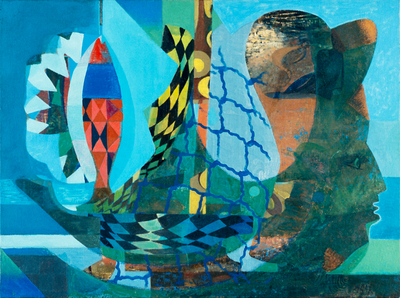
A popular pigment among painters, Pablo Picasso, Wassily Kadinsky, Yves Klein and others all chose to base many of their works on the colour.
To kick off Art UK's colour series – and because the history of art is inseparable to the history of colour – let's dive into the history, chemistry and symbolism of blue.
Lapis lazuli
The earliest forms of blue pigment were extracted from the semi-precious limestone rock mixture 'lapis lazuli'. Originating from the Middle East, in particular, Afghanistan, the word's etymology comes from the Latin 'lapis', which translates into 'stone', and 'lazuli' meaning 'blue'.

This pigment was regularly imported from Asia, across the Silk Road, dating back 6,000 years up until the eighteenth century. Extracted from the remote Sar-e-Sang valley in the Badakhshan mountains in Afghanistan, it would eventually make its way to the bustling cosmopolitan towns of western Europe.
Scholars argue that for many millennia civilisations prized the rare stone, believing it to have mystical properties. Lapis lazuli was particularly popular in ancient Sumer and ancient Egypt when it was used for jewellery, headdresses and even the tomb of pharaoh Tutankhamen, as well as (allegedly) the eyeshadow of Cleopatra.
Chemist Heinz Berke points out: 'early mankind had no access to blue because blue is not what you call an earth colour... you don't find it in the soil.'

The rarity and difficulty of accessing blue pigment encouraged civilisations to imbue the colour with mystical properties.
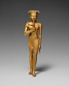
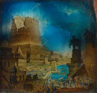
Egyptian blue
Unlike lapis lazuli, Egyptian blue is a synthetic pigment that was developed approximately 4,500 years ago. A bright crystalline substance, it is a lighter shade than lapis lazuli.
This synthetic shade was created to meet the expensive demands for lapis lazuli and blue in ancient Egypt, as they believed the colour was associated with the heavens, fertility and the power of creation.
The pigment spread throughout Egypt, Greece and eventually into the Roman Empire. When the Roman Empire declined, the colour temporarily vanished from cultural use.

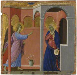
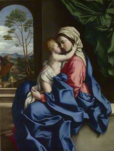
Ultramarine
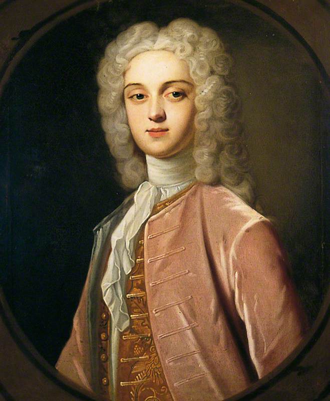
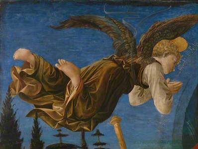
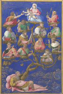
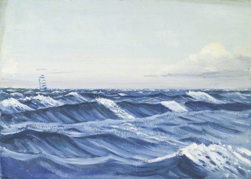
Jumping ahead in time, a blue pigment known as 'ultramarine' (meaning 'beyond the sea') became incredibly popular during the Italian Renaissance. Used widely in Europe from around the twelfth century, ultramarine is one of the most prevalent colours in western art history.
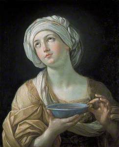
The Dead Christ and the Virgin
1330s-40s
Giotto di Bondone (1266/1267–1337) (Neapolitan follower of) 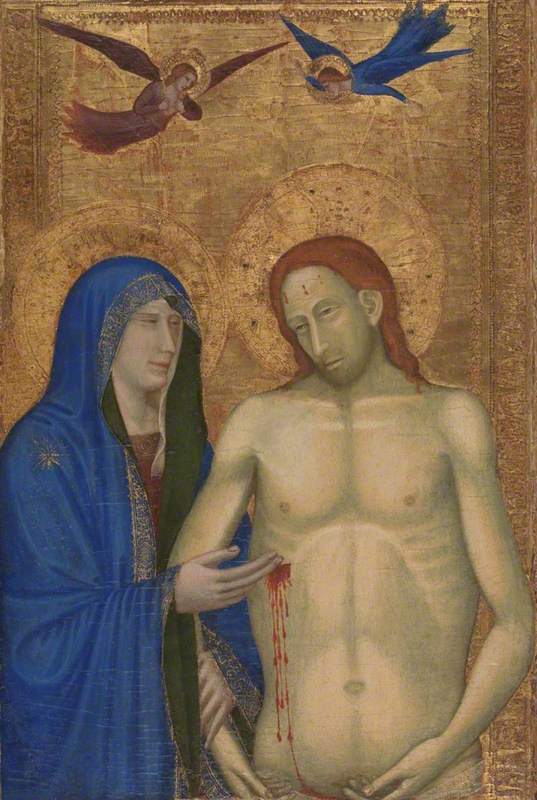
The deep blue pigment was made by grinding lapis lazuli into a powder. However, when ground too finely, the blue would turn into a dull grey.
Ultramarine was once so expensive it cost more than gold. However, it became widely available and was commonly used by Italian artists in the fourteenth and fifteenth centuries.

Artists like Cimabue, Duccio and Giotto were some of the first to regularly use the pigment, which they would often juxtapose with gold leaf.
In his Il Libro dell'Arte ('Book of Arts'), painter Cennino Cennini gave instructions on how to prepare ultramarine pigment, which involved a lengthy purification process.
Cennini wrote: 'Ultramarine blue is a colour illustrious, beautiful, and most perfect, beyond all other colours; one could not say anything about it or do anything with it, that its quality would not still surpass.'
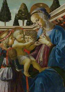
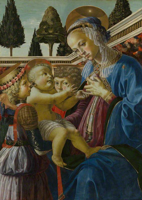
The Virgin Adoring the Sleeping Christ Child
c.1490
Sandro Botticelli (1444/1445–1510) 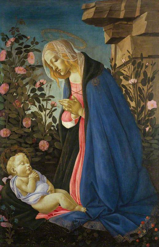
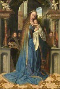
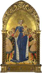
In the following centuries, artists such as Raphael, Botticelli and Titian continued to use abundant amounts of ultramarine pigment in their large-scale works.
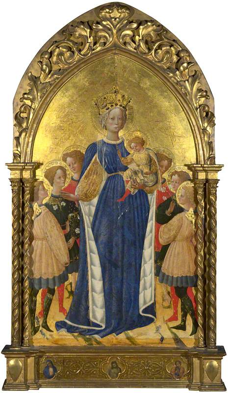
In Christian iconography, blue became one of the most sacred colours. The religious connotations of the pigment were also because it was so expensive. Artists preserved the most costly colours for important religious subject matters, like the Virgin Mary. A particular shade was even named after her, 'Marian blue'.
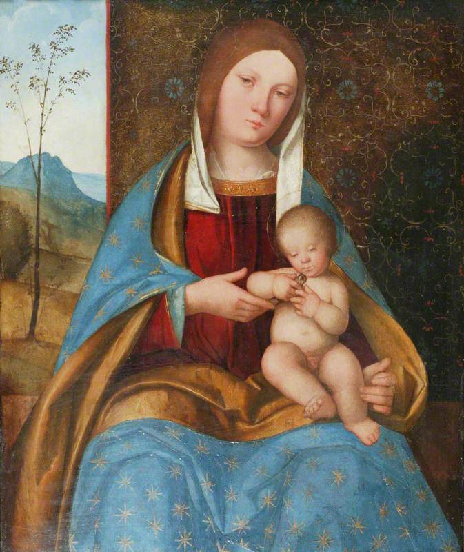
The Virgin and Child with Angels
1500–1509
Quinten Massys (1466–1530) 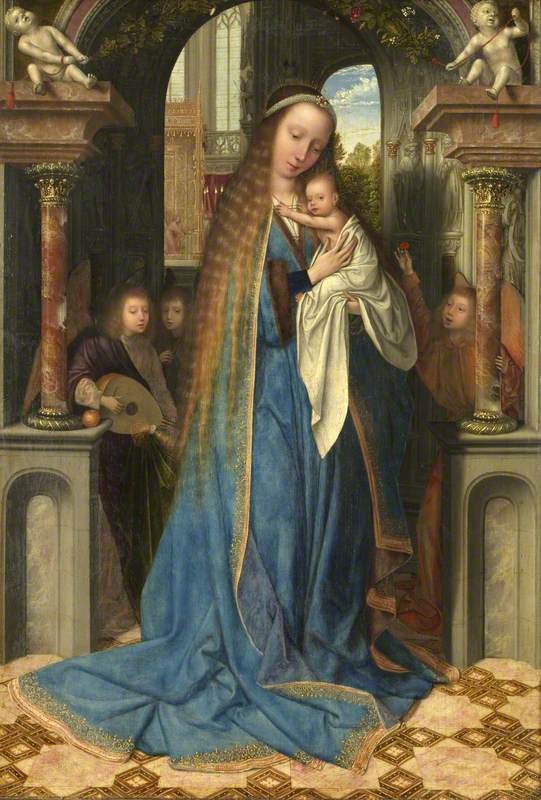
Indigo
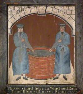
This eighteenth-century work by an unknown artist shows two indigo dyers standing on either side of a dye vat. Indigo became an important colour and dye in the sixteenth and seventeenth centuries.
Sign for the 'Blue Boys' Inn'
late 1700s
unknown artist 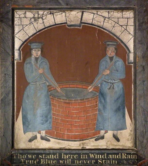
In fact, it became so important that it ignited trade wars between European countries and colonised territories in the Americas, fuelled the African slave trade and became part of Sir Isaac Newton's 'colour spectrum', which he first published in 1672.
Derived from the indigo crop, known as Indigofera tinctoria, the colour was also imported along the Silk Road, from India and Egypt.
unknown artist 
The natural dye extracted from plants was also used to dye clothing. A peasant movement called the 'Indigo revolt' took place in Bengal in 1859, when indigo farmers rose up against their plantation owners.
The first synthetic indigo dye was made by the German chemist Adolf von Baeyer in 1878, but this was replaced by the natural crop by 1913. It is this latter form of indigo that was used to dye jeans.
Prussian blue
Prussian blue is a hue of blue that emerged in Germany in the eighteenth century when the Swiss paint maker Johann Jacob Diesbach invented the synthesised pigment.
In March 1708, he had sent a letter to Gottfried Wilhelm Leibniz, the president of the Royal Academy of Sciences, explaining his discovery of a pigment he called 'Preussisch blau'.
The synthetic pigment was much cheaper than ultramarine and was easier to create.
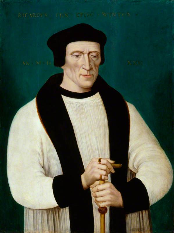
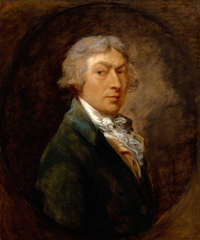
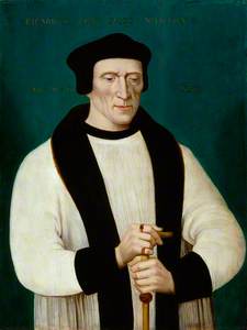
Prussian blue pigment was used in this painting showing the Tudor bishop and statesman Richard Foxe. The painting had previously been believed to be from the sixteenth century until analysis of the pigment showed the use of Prussian blue, which was not widely used by artists until the eighteenth century.
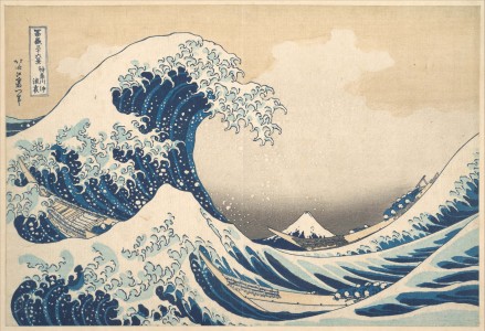
Although the pigment developed in Germany, it became widely used by Japanese artists, particularly Katsushika Hokusai, and is associated with woodblock prints, such as his famous Great Wave.
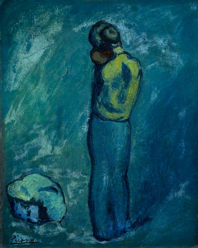
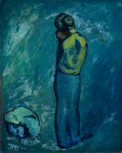
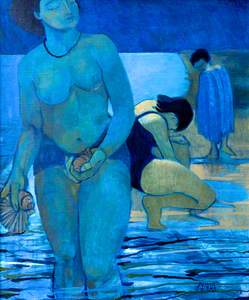
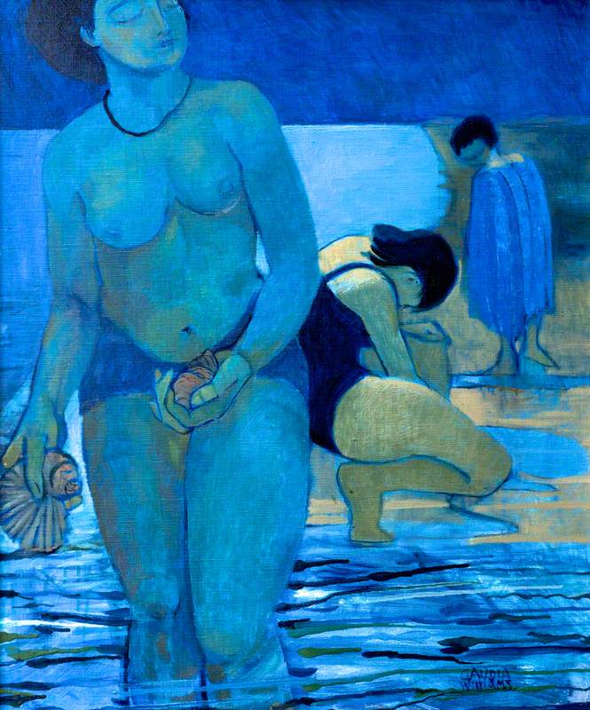
During Picasso's 'blue period' (1901 to 1904), the Spanish artist focused on using many shades of blue, particularly Prussian blue.
His sombre paintings reflected the artist's period of depression – it marked a time when he was living in relative poverty and experiencing emotional turmoil over the suicide of his close friend and fellow painter Carlos Casagemas, who had shot himself in 1901.
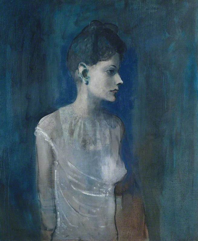
A reflection of his melancholy, his subject matters were usually of prostitutes, drunks and beggars. Picasso's blue period helped to strengthen the associations of the colour blue with feelings of despair and sadness.

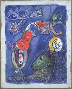
Another artist who had a strong connection to the colour blue was Marc Chagall. Picasso had once said 'when Matisse dies... Chagall will be the only painter left who understands what colour is.'
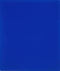
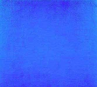
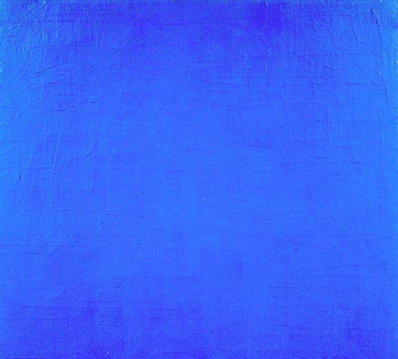
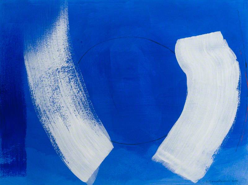
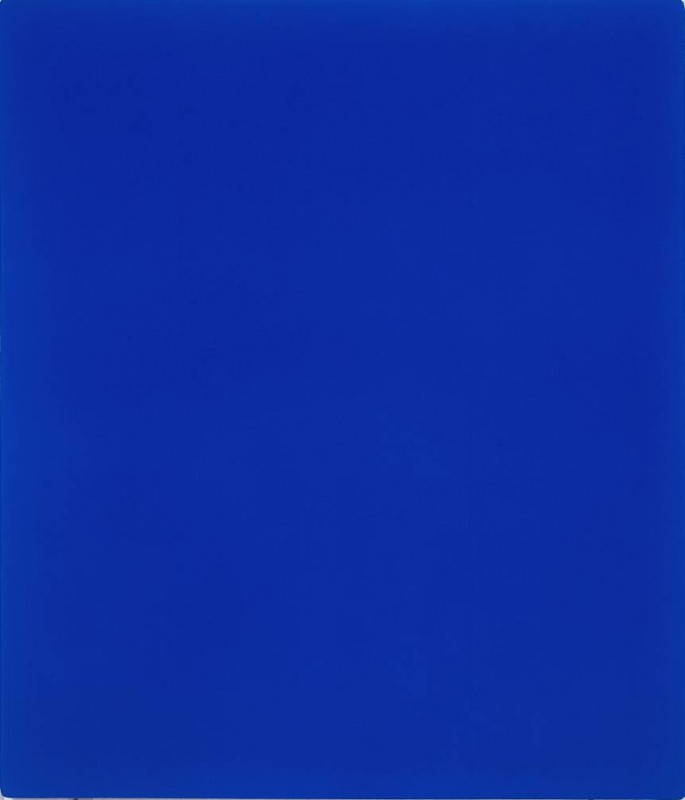
International Klein Blue
Perhaps the artist with the most famous and enduring association with the colour blue was Yves Klein.
In the summer of 1947, the French conceptual artist decided he wanted to capture the sky's expansiveness through painting, naming himself a painter of space. In the same year, he began to spray paint his canvases in shades of blue, initially using ultramarine. He would create nearly 200 of these blue monochrome paintings.
By 1960, he had created his own version of blue pigment, known as International Klein Blue (IKB).
For Klein, the colour blue was intrinsic to his aesthetic philosophy: 'blue is the invisible becoming visible. Blue has no dimensions, it is beyond the dimensions of which other colours partake.'
If you're blue that this is the end of the article, look out for more explorations of colour in art soon...
Lydia Figes, Content Creator at Art UK