Download and subscribe on Apple Podcasts, Stitcher or TuneIn
Art Matters is the podcast that brings together popular culture and art history, hosted by Ferren Gipson.
Art and the Olympics go together like peanut butter and jelly – didn't you know? Art has been an important component of the modern Olympics since almost the very beginning. In fact, were it up to Pierre de Coubertin, art would have been part of the very first games in 1896.
"The most important thing in the Olympic Games is not to win but to take part", Pierre de Coubertin #OlympicDay #125IOC pic.twitter.com/DhlwI5oHRY
— Olympics (@Olympics) June 23, 2019
'Pierre de Coubertin is generally acknowledged to be the architect of the modern Olympics,' says Margaret Timmers, author of the book A Century of Olympic Posters. 'He had a vision for the games, and that was to foster excellence through sport, and also to help sport to create a national and international understanding, but he also believed in excellence in other fields as well, in aesthetic fields, even moral fields.'
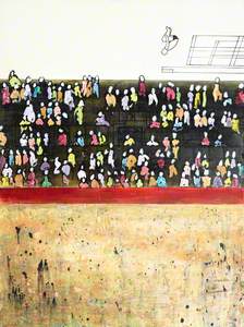
Olympic Games poster, Stockholm 2012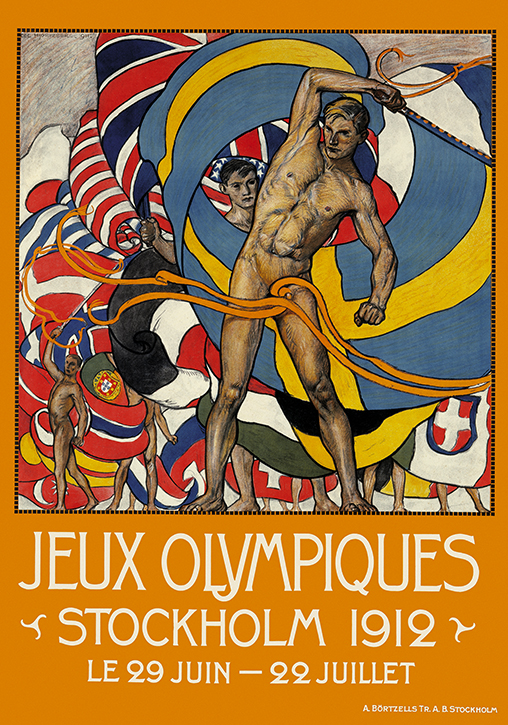
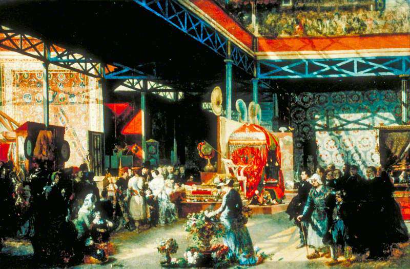
The first modern games included many of the events we watch today, like gymnastics, fencing and athletics. They also included the discus throw and the marathon, specifically, as a connection to the competitions of the ancient games. Pierre de Coubertin also wanted to hold art competitions, but this didn't happen until the 1912 Stockholm Olympics. There were competitions in sculpture, painting, music and more. The subjects of these works were typically related to sports, of course, and countries could take home medals.
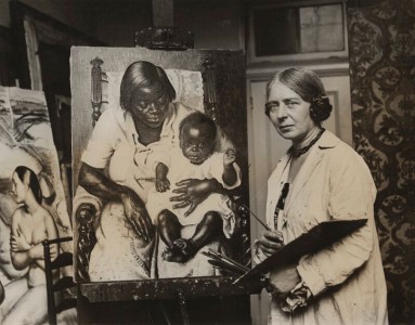
British artist Laura Knight won silver for her painting of boxers in 1928, and Alfred Thomson took home the gold for Britain in 1948. He was the last person to win a gold medal for painting, as the events have not been held since.
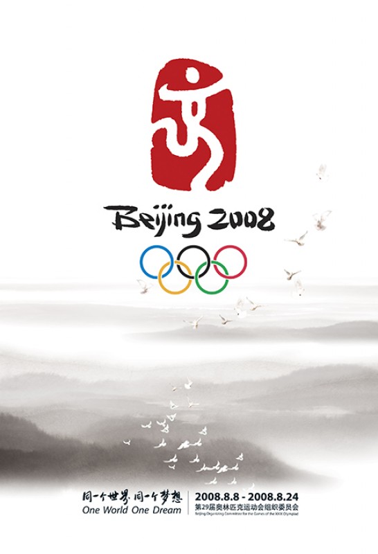
Although there were amazing art competitions, one of the biggest art connections to the Olympics for most people are the poster designs. The two Olympic Games after 1896 were held in Paris and St Louis, and were done in connection with huge world's fairs happening at the time. Because these were part of a wider event, the promotion for these events was a little lost. The first games to get their own official poster was for the 1908 Summer Olympics in London, and the first to really make an impact was the 1912 Stockholm poster by the illustrator Olle Hjortzberg.
105 years ago today, the Summer Olympic Games in Stockholm came to an end. Pictured here, the official poster of #Stockholm1912 #Olympics pic.twitter.com/8LNIziBvqJ
— Olympics (@Olympics) July 22, 2017
'In a way, his poster set a trend, his composition showed a parade of idealized male athletes, nude, invoking the ancient Greek ideals of male physical beauty,' says Margaret. 'It was printed in 16 languages and distributed worldwide. It was banned in one or two instances because it contravened a moral code, but actually it was extremely popular and additional copies were immediately required.'
Olympic Games poster, Paris 1924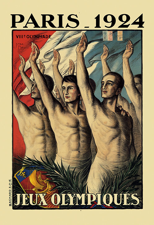
Around this time, posters were designed by well-known artists who were selected through competitions organised by an Olympic committee. After the First and Second World Wars, the games became much more popular and the role of the posters became more important. Just like the elaborate opening ceremonies that have become part of the excitement surrounding the competition, poster designs are an opportunity for the host country to tell the world about themselves. Designs can feature cultural elements from the host country and celebrate some of their top artistic talent.
Winter Olympic Games poster, Chamonix 1924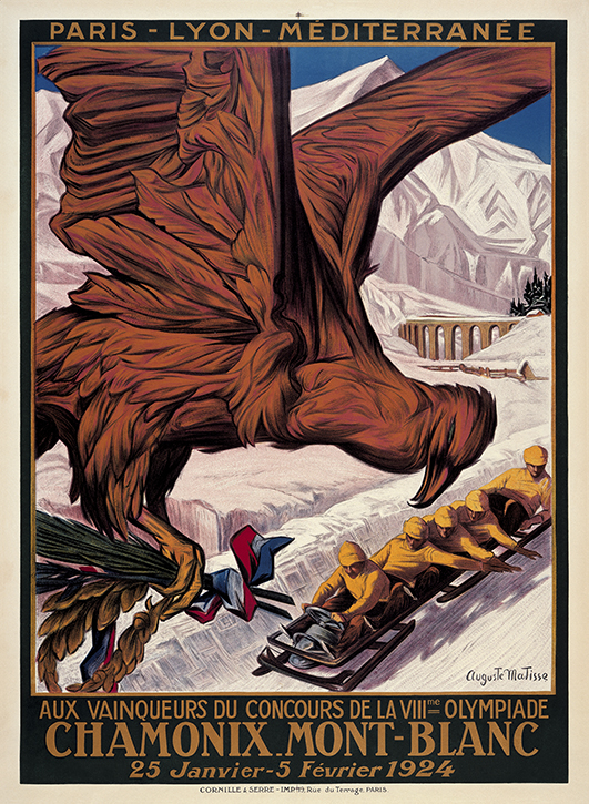
'[Seoul] had a whole series of culture posters, which was to try to introduce Korean culture to the world with images of a festive fan dance, and of a traditional Korean screen painting, for example,' says Margaret.
One of the most exciting years for art was the 1972 Olympics in Munich.
The colours for the official posters were what you would expect from the 1970s, with bright oranges and greens. They have a photographic quality, and show athletes in action. This is actually one of two strands of posters that were created that year.
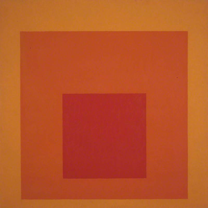
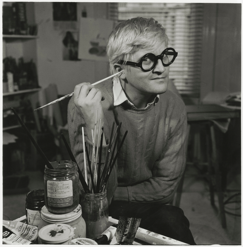
Alongside these more graphic posters, there was a special set of 35 posters created by some of the most exciting contemporary artists of the period. It includes works by Jacob Lawrence, Josef Albers, David Hockney and more. This special set was called the Edition Olympia 1972 series, and artists were free to create almost whatever they liked.
'David Hockney ... played on his favourite swimming pool theme. He created a wonderful image of a diver at the perfect point of entry into the water,' says Margaret. 'The posters were very varied, but all in the Olympic spirit commission theme, and they produced three grades of poster, which range from signed numbered additions, which were aimed at wealthy collectors, to affordable commercial additions. Even now, those posters are some of the most collected today.'
Munich took an international approach, commissioning artists from all over the world, but it doesn't have to be done this way. Many hosts commission artists from their own country. In 2012, London did just that, producing a vibrant set of posters from some big-name artists, including Michael Craig-Martin, Anthea Hamilton, Chris Ofili, Rachel Whiteread and others. Let the record show that Bob and Roberta Smith – who is the brilliant artist of the Art Matters painting you see as the logo of this podcast – designed one of the posters for the Paralympics.
'[The London organising committee] wanted to link the games, as de Coubertin had done in the beginning, with high aesthetic values and so four of the artists commissioned have actually previously won the Turner Prize, and five had represented the UK at the Venice Biennale,' says Margaret.
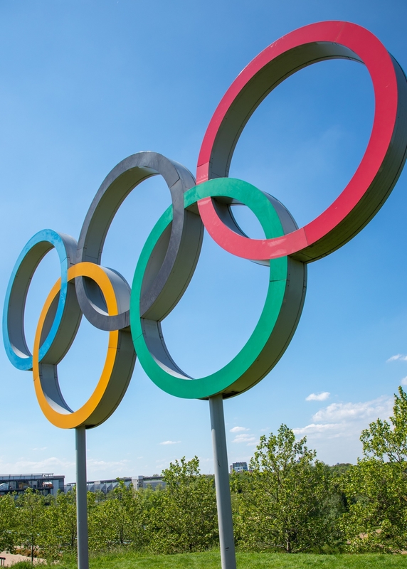
These posters include some abstract interpretations of the Olympics and some ideas that are closer to what you might expect. Rachel Whiteread made a design that looked like cup rings in the Olympic colours of red, yellow, green, blue and black. Apparently, the playful take on the Olympic rings nearly wasn't approved for brand reasons.
Olympic Games poster, London 2012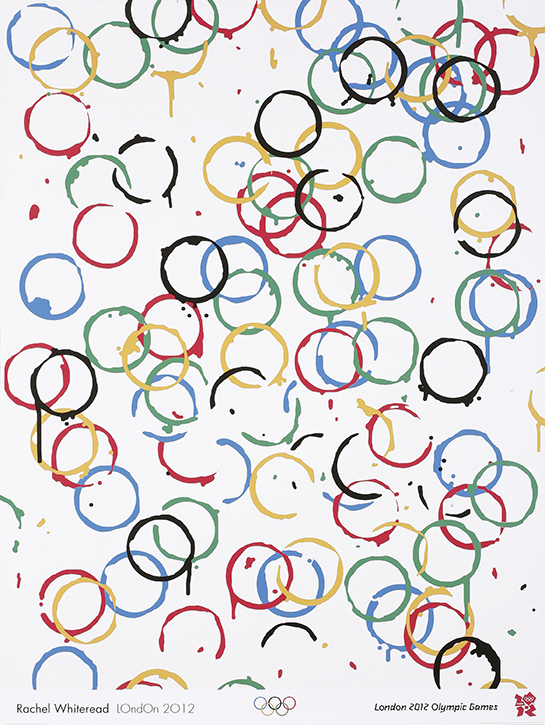
Each artist has worked within their own unique style and it works well. This approach is something that has changed a lot since the early posters inspired by the classical world and more traditional symbols of national pride.
The posters for Tokyo 2020 draw on an interesting mix of artists.
We're delighted to unveil #Tokyo2020 Official Art Posters!
— #Tokyo2020 (@Tokyo2020) January 7, 2020
https://t.co/8Jww69srDG
Which one is your favourite?@Olympics @Paralympics pic.twitter.com/C2UJXXby4x
British artist Chris Ofili returned to do a design called The Games People Play that shows figures contorting into impossible shapes in front of a pink-hued sun. There are also many Japanese artists represented, including manga artist Naoki Urasawa and the calligrapher Shoko Kanazawa. Urasawa's comic-like poster conveys the action and dynamism people love so much in manga, and celebrates a brilliant Japanese art tradition. As the years have progressed, the art and design of the Olympics have become an important way of building excitement and anticipation for one of the world's biggest sports competitions.
'They herald the games, they shape our expectations of what's to come, and they're a fascinating historic record of course,' says Margaret. 'They sometimes reflect contemporary art movements, and highly collectable works of art and design, that are often the images that remain in our mind's eye when we think back over past Olympics.'
Listen to our other Art Matters podcast episodes